
Have you heard about this Pantone color of the year?” my non-design-focused husband asked me the other night. His feeds are completely different from mine, filled with photography tutorials, comedy reels, and nostalgia-filled content; so Pantone has made its way into their algorithm that tells me what I need to know this year: Everyone is talking about it, for better or for worse.
In case you’re as ignorant about it as my husband was without last year’s viral chat, Pantone — an international authority on all things color — chooses a “color of the year” every December. Since 1999, many other companies, from paint brands to home siding manufacturers, have followed suit, none more waiting than Pantone. Their chosen colors for the upcoming calendar year speak to the intersection of culture, current events and design. So, while you may see velvety peach as an option (as we did them in 2024), it may not mean that soft oranges are on-trend in the traditional sense, but more because the “mood” of our world, through their lens, matches their preference. Their language used around the shades often sounds like this (from 2024): “Pantone 13-1023, or Peach Fuzz, promotes a feeling of closeness and connection, acting as a balm in times of uncertainty.”
In a moment of turmoil, discord and change, that feels like an epidemic of selfishness and distancing from the greater good by authority figures (not to mention, though unrelated, a move towards maximalism and the recent explosion of color and pattern in our homes), Pantone decided to choose…
white.
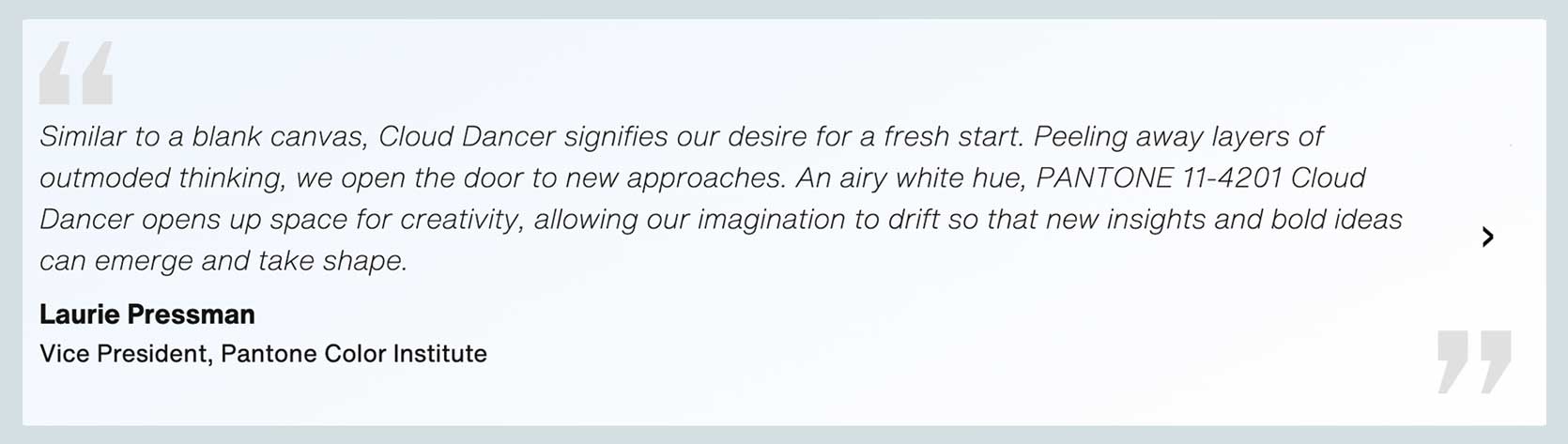
Pantone 11-4201 Cloud Dancer To be precise: “An elevated white color that serves as a symbol of calming influence in society while rediscovering the value of calm reflection.” Hmm…interesting choice of words.
I’m not the only one who paused for a moment to think “Uh…what?” Almost as if an amber alert went off on all of our phones and we collectively went to work sharing our cool thoughts on our social platforms, my feed was filled with shocked and salty opinions. At best, Cloud Dancer feels lazy; At worst, at least according to some of the outraged posters, tone deaf and even supportive of an “all-white” agenda.
Reactions and rejections
Let’s take a look at some of the strong sentiments heard around the interwebs.
I admit, initially, I let resentment get the better of me. I saw someone write that the noise around a color is louder than the color itself, which was absolutely correct. After sitting with it for a few days, I decided that, for me, it’s just uninspiring. Those copywriters had to work overtime to find a way to make white — and keep in mind, a boring middle-of-the-road white with no inclination to be warm or cool — look interesting. Here are quotes from the two key figures at Pantone, and boy, I’ve never seen so many creative words used to describe homeowner White:
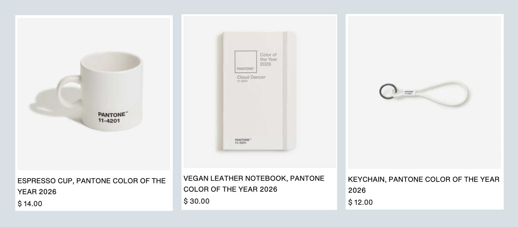
The product collaborations associated with this release are even more ironic-hilarious. There’s white Play-Doh. A white mug. A white key chain. A white notebook. Joybird, which has been releasing an exclusive Pantone COTY collab line in recent years, launches…white furniture. You mean, what did they already have lying around in the warehouse, maybe renamed Joybird x Cloud Dancer? This is absolutely stupid.
Is Pantone just bugging us out of anger?
I also saw an article from Allure (yes, the beauty/women’s lifestyle magazine) that questioned whether the poll was intended simply to stoke anger. To rekindle people’s attention and emotion around the Color of the Year conversation, which has felt a bit stale over the years. To be honest, the last time I found this interesting was in 2016 when they launched the first “We Can’t Decide” pair rose quartz and peaceAnd I can almost guarantee that everyone will see next year how far it is from Cloud Dancer, Genius marketing and PR move or just obnoxious? (I’m leaning toward the latter; if your real intention is to thrash society over the embers, don’t act like you’re trying to say something about stability and peace, you know?)
But something I’ve been working on lately is staying curious instead of jumping to assumptions. What if Pantone was, in fact, looking for a clean slate? Deliberate restraint from the noise of *everywhere* and *everything.* Sure, “white” is insulting in its simplicity for something of this nature, but last year there was brown (mocha mousse). Personally, I know my entire soul is tired for many reasons, so perhaps the emptiness that a color like Cloud Dancer creates is the quiet fortress of solitude that some of us need so much right now to escape the constant distraction.
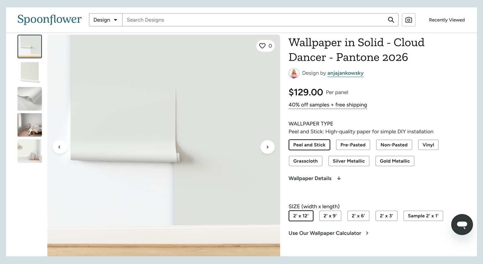
Is it ripe for an exciting product release? Absolutely not. Some of them are quite mind-numbing, like the one artist’s Cloud Dancer white wallpaper on Spoonflower – which is being applied over a white wall – is painted. In years past, the brand has released a ton of fun prints in partnership with Color Authority (this is from last yearthis year? Nothing official, just whatever third party artists have done…and I don’t blame them. As a design editor, my inbox is always filled with PR people sharing products from their clients in the same colors as COTY, hoping I’ll include them in a roundup about the announcement. This year I received two messages. Two. Talk about a blank slate for my Gmail account. In that sense it quieted the noise, that’s for sure.
What does Cloud Dancer say for the interiors of 2026 and beyond?
Since this is a design blog and not the op ed section of your chosen newspaper, I’d like to introduce some interior-focused conversations as well. For example, when I brought this topic up to Emily, her initial dilemma was: “Does this mean that clean and bright interiors could be making a comeback? And, even more controversial, are cool whites going to dominate warm whites in 2026?” I don’t know, but it fits with the natural progression of things. I think there’s still some juice left to squeeze out of the hot neutrals, possibly for the next three to four years. But what happens then? Well, people move in the opposite direction. No warm colors anymore, all cold whites and grays, as was the case in the early 2000s. We went from cherry red woods and browns and beiges to millennial grays and contemporary whites. Time will tell I suppose.
Until we get there – God please don’t go back there – I wanted to celebrate a few select colors of the year from other companies, to make it feel like the people sitting in the room making the decisions weren’t trying to annoy us, but inspire us.
Let’s start with Coloro x WGSN, who released their 2026 COTY in 2024, and have just announced their 2027 colorway. Yes, they work very well, given their nature, unlike some other brands. WGSN is a trend forecasting authority that largely drives product creation, while Colorow is a color expert, so the two come together to choose a unique color of the year.
For 2026, they went with transformative tealWhich is absolutely luminous. The kind of color you can’t take your eyes off of; That you dream of being courageous enough to use in some capacity. In the right application it is rich, dramatic and timeless. To keep an eye:
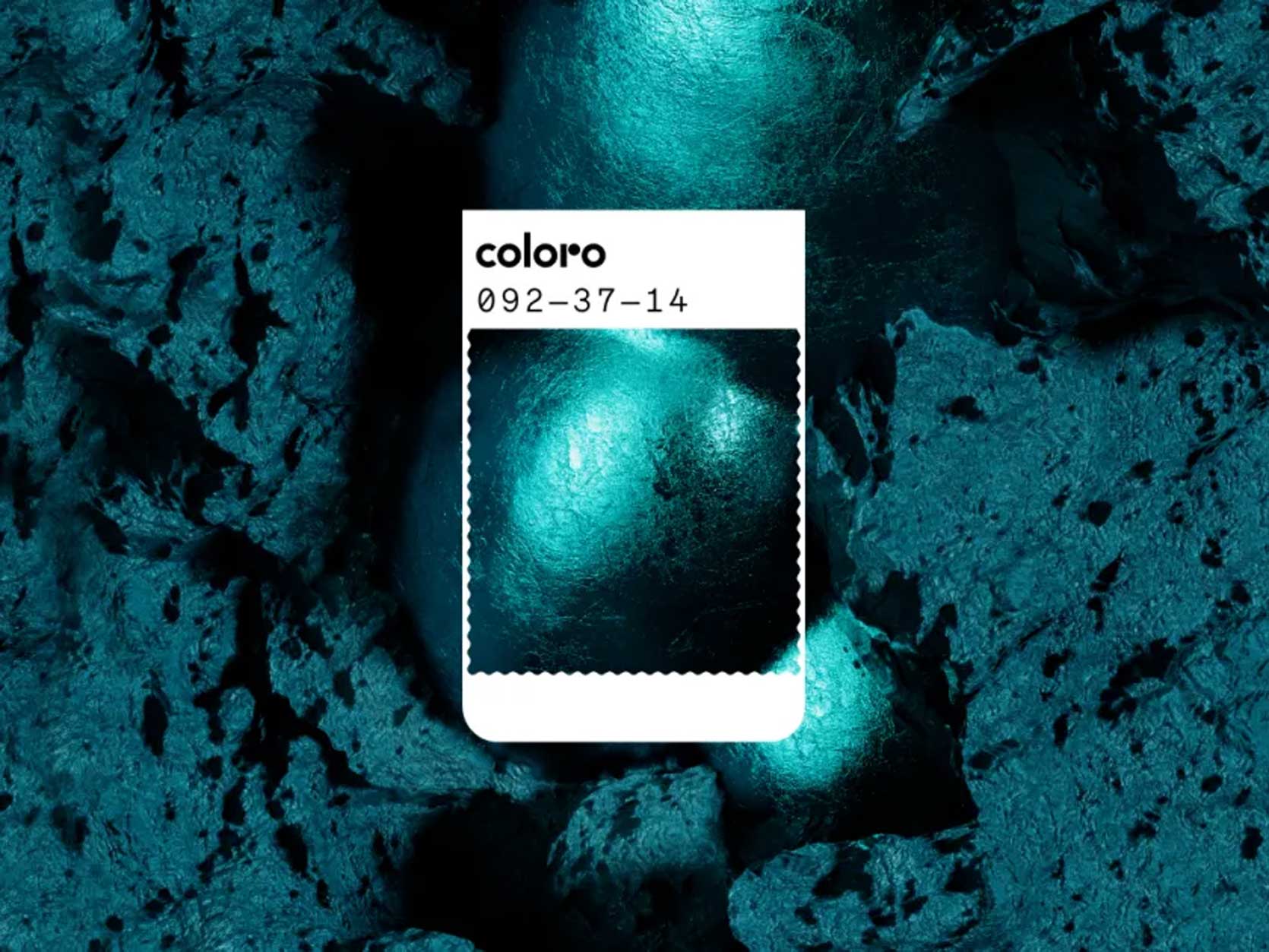
Can you imagine this on hand-glazed tile in a bathroom?!? As a border accent on a luxurious rug? It says something, ::cough cough:: unlike the original white.
Now, on to 2027 for WGSN x Coloro. Get ready, because if Transformative Teal speaks a lot, the next one has a megaphone in hand.
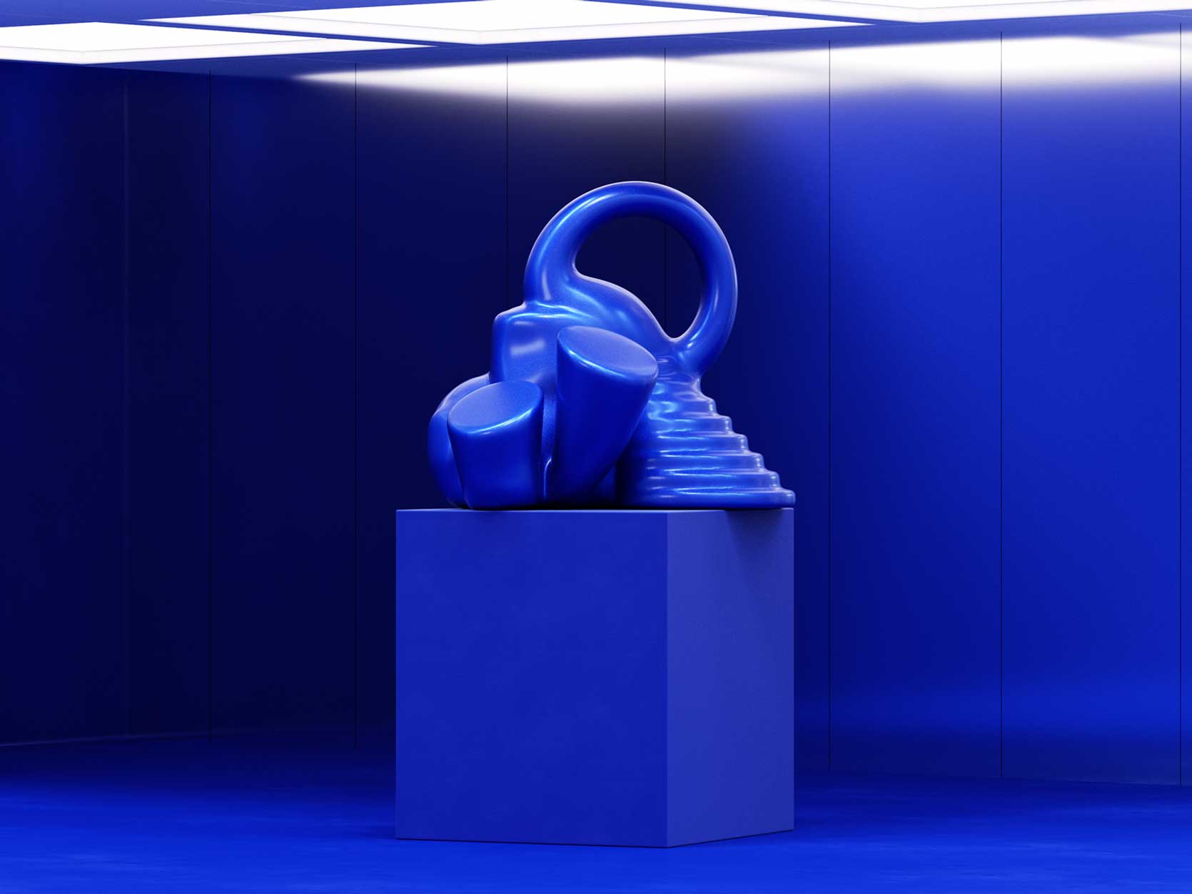
feast your eyes bright blue::Standing above; applauds; Noise:: Look, claiming a color of the year goes way beyond what color we paint our walls, okay? You might look at this International Klein Blue-esque shade and think “not for me or my home,” but it goes far beyond the walls you’re surrounded by, It provides information on fashion, packaging, product design, branding and marketing, Something like that can’t be quickly forgotten, and isn’t that worth celebrating?
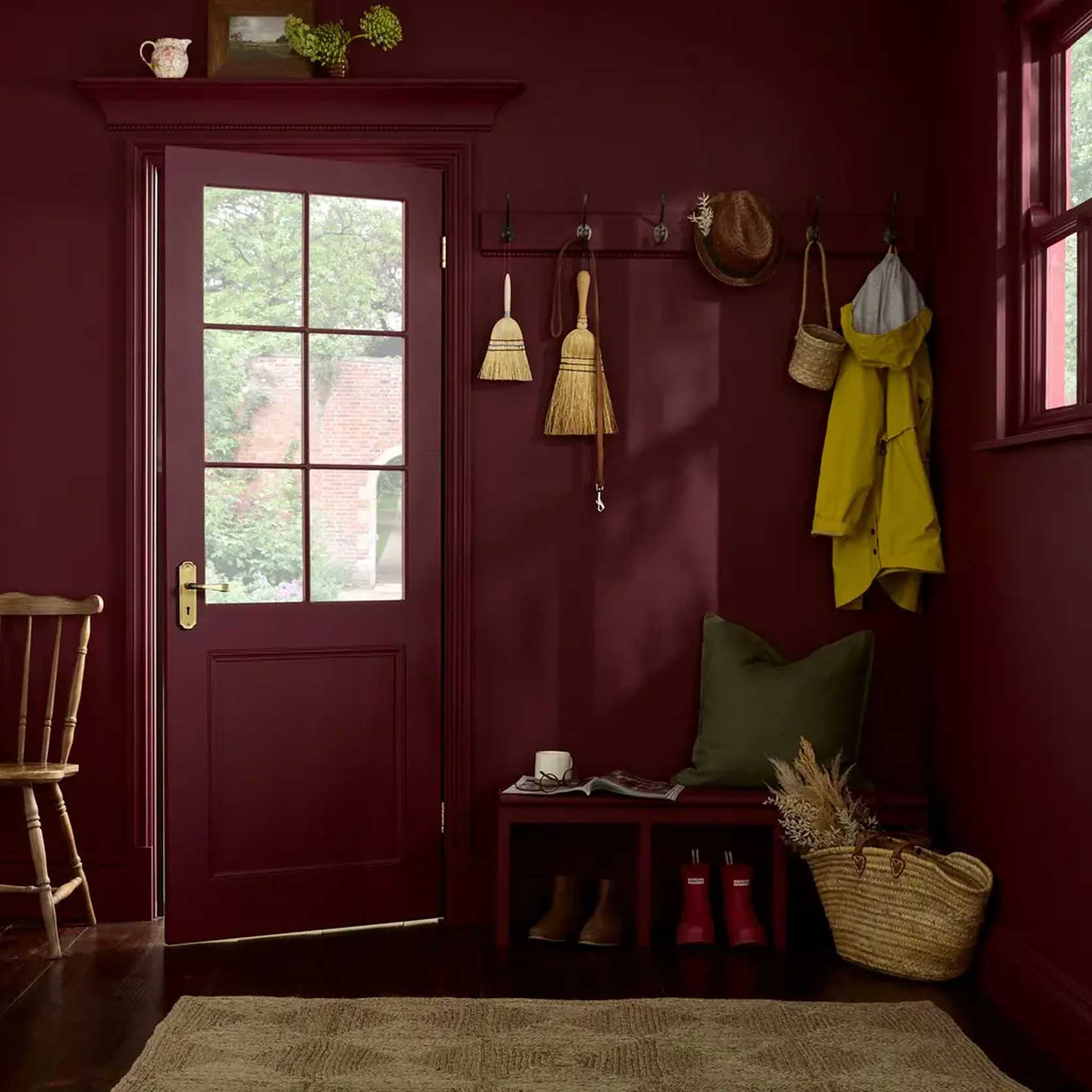
This third color, Divine Damson by Graham and BrownAnother deep jewel tone, and I’m making no apologies for it. Instead of quiet reflection and going within as Cloud Dancer claims we want, I think we should all be living the truest, most courageous versions of ourselves. No more fakery, no more shrinking. Be authentically you; Sure, this might be the person who feels most stable in a bright and neutral room, but it might also be the person who wants to be embraced by a mulberry-meets-garnet burgundy.
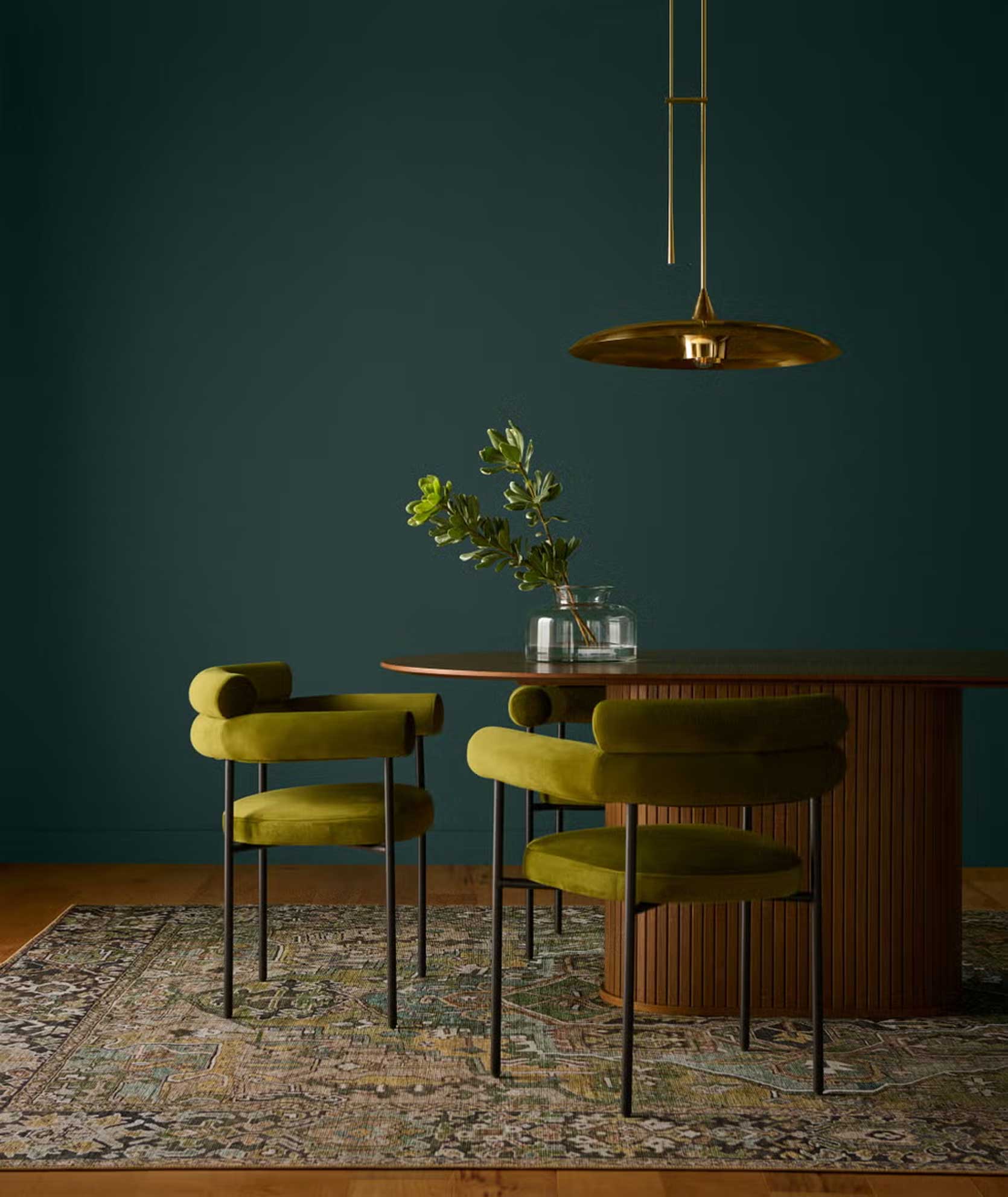
And finally, in a position of honorable mention, is Behr’s hidden gemThis was the first COTY announced this year from paint company heavy hitters, and I have to tell you I was not overwhelmed with emotions when I saw it, Mostly because I feel like I did Went Been watching this for a while now. It didn’t feel new or fresh or visionary. Unlike Transformative Teal, which has incredible depth, this one is chalky and milky. It’s pretty, sure (I had walls this same color by Farrow & Ball years ago), but it’s to be expected.
However, I’d still take it over Cloud Dancer, and for that, it made my list. It’s soothing and welcoming and intense, and, from a design perspective, works beautifully with many other colors; I’m partial to warm-leaning colors like olive in the chairs above.
,
So that, my friends, is how I brag about the color. Based on how many articles and posts have appeared on the same topic, some might say that Pantone has won. The most brilliant public relations move ever; But I don’t like to feel as if something has been done to me, so for that I don’t consider Cloud Dancer at all.
I’d love to hear your insights, thoughts, comments (angry or happy or otherwise), and especially anything I’ve missed or not considered. What are you seeing that isn’t me? Let’s keep talking about it.
Until next time, friends…
*Opening Image Credit: Photo Courtesy pantone